Search This Blog

Showing posts with label Australian Housing Bubble. Show all posts

Monday, November 19, 2012

Post-construction boom plan?


There is a lot of talk recently about RBA's new great idea of replacing the mining boom with a construction boom. It is quite possible that could work, and we continue growth by shifting ex-mining investments into housing construction. This is not new idea. It was very "successfully" implemented in quite a few places around the world recently. Irish and US governments successfully replaced IT boom of late 90s with period of steady growth driven by construction boom. Chinese government partially did the same thing after their export boom ended. Historically, it seems it's quite easy to succeed with this plan.


BUT, there is one much more important question that nobody seems to be asking  in Australia: even if the great idea of construction boom replacing mining succeeds, what will replace construction boom at its end in three or five years? 


If everything goes as planed, in just 5 years we will have million more homes - half of them empty (around half a million more new homes than new households), we will have around half a trillion more debt (half a trillion less invested in productive business and infrastructure) Maybe we can continue doing the same for 5 more years after. By than we should have million more empty homes and trillion more in debt.

BUT, what will happen after we take more debt and misallocate it into more empty houses? What is the great idea promises us after?

I'm scare even to think about this.
I hope our government's great ideas fails quickly. I hope for that not because I think we will be fine if it fails (we will not), but because I'm sure in 5 years we will be much better than if they succeed. For majority of Australians (especially our kids) going into few years long recession in 2013 is much better option than going into decade long deep depression in 2018.

I hope, we learned something from other's mistakes.

Wednesday, February 8, 2012

Market Inventory vs Bubble Burst

There is strong belief among Australians that housing market will not crash because majority people will not be willing or forced to sell for reduced price. Although it is true that majority of people will not sell at low price, there is misconception how many forced or willing sellers is necessary to crash the market.


Let's see behaviour of market stock in Australia over the past 5 years or so:


Chart1 Stock on the market RPdata
 From the chart, we can see that number of homes for sale doubled since first housing troubles started in 2008. Stock slightly decreased during short boom in late 2009 - early 2010 but increased 50% since then. Similar data comes from SQM - Chart 2
Chart2 - Stock on the market SQM
 From observation of a recent events in USA, I noticed that significant rise in inventories is not needed for price to crash. If we take a look at US existing house inventories (Chart 3) we can clearly see that inventories didn't increased more than inventories in Australia.
Char3 - US existing home inventory

From the chart we can see that home inventories in USA at the peak were lower than current inventory in Australia. At the peak inventories were only about 4% of total housing stock, while that percentage already passes 4.5% in Australia.  It is hard to say that 4% of the total stock is extreme number that caused 33% price crash in USA. We should also notice that stock on the market fell in late 2008 early 2009 when house prices dropped the most. This means there is something else that significantly affects house prices.

Lets take a look at sales:

Chart4 - US home sales
It is clear that drop in sales, significantly affected housing market in USA. Lack of buyers seems to have much larger effect on price than rise in inventories. It is expected there will always be significant number of people forced or willing (for any reason) to sell, but it's hard to expect significant number of buyers (especially if credit freezes and/or unemployment hits).

Let's see whether this holds in Australia

 
Chart 5 - Australia home sales
 It is clear that house price fall in 2008/2009 was caused by significant fall in sales. House prices recovered driven by new buyers although stock on market remained elevated compared to pre 2007 levels.

It looks like inventory levels at the moment are more than enough to enable market crash, it's up to buyers to set market direction. Recent drop in sales (since 2010) is larger than drop recorded in USA during the first two years of price contraction. If soon buyers do not return to the market in large numbers, we may expect price fall to accelerate. There is no need for mass panic sale for prices to fall significantly.

Friday, July 29, 2011

"Predictions" by Google Insight

There are a lot of discussions about timing of Australian property bubble. It is impossible to predict timing of events such is bubble burst but to make this interesting I checked Google Insights for Search to see whether search for “property/housing bubble” can be used for predictions.
Findings are quite surprising – see charts.

Charts 1 House prices and Google Searches - Ireland

Charts 2 House prices and Google Searches - Spain

Charts 3 House prices and Google Searches - UK

Charts 4 House prices and Google Searches - USA


From charts you may notice that peak search for phrases “property/housing bubble” happened 2-3 quarters before bubbles bursted in these countries. This is very interesting and IMHO probably tells a lot about the fact that sentiment plays very important role in market movements. What is surprising to me is the fact that search for bubble information drops before bubble bursts and stays lower when most equity wealth disappears and most of people lose their homes.    

Now, lets take a look at Australian search for "housing bubble"

Charts 5 Google Search "housing bubble" - Australia
Search for "housing bubble" peaked in November 2010 - 8 months ago. Based on Google Insight for Search information for other countries with similar housing bubbles, Australian housing market is just at the turning point and future doesn't look good. Data that is being published these days suggests that Google might be right.

BTW. UK market also doesn't look promising after slight recovery in 2008, "search sentiment" is up again.

Monday, March 21, 2011

Australian Housing Shortage/Oversupply by State/Territory

Our previous paper showed that there is very likely to be oversupply of homes in Australia. Now we want to see where all that oversupply is located. We will make comparison between different states in Australia and add comparison with some of the states in USA that are well known for their housing bubbles followed by oversupply. This way we may get a feel about different supply/demand values compared to other areas with similar demographics.

We used data is available for all selected states and territories. Population growth and new dwelling construction data is used. There is no data available with detailed breakdown of new resident population for each state or territory. We also compared Australian states and territories with a couple of USA states that had large housing bubbles followed by price collapse and huge oversupplies of homes. We also included Texas, high population growth state that didn’t experienced housing bubble in last two decades, as an opposite reference.

USA is selected for comparison because of very similar demographics to Australia. Main supply/demand demographic measures such are household size and change in household size, median age, population over 65 and under 14, birth rate, dependency ratio, percentage of one person households, urban population growth etc) are very similar. For new construction data in Australia we used ABS New Dwelling Unit Commencements data.  For new construction data in USA we used New Private Housing Units Authorized by Building Permit provided by Federal Reserve Bank of St. Louis. Number of newly constructed dwellings for US is likely to be slightly lower because not all approvals are commenced. We used data for the most recent period from June 2000 to June 2010.

We calculated two simple measures that we call: Rate of Construction and Rate of Occupancy. Rate of Construction is a number that shows how many new housing units are constructed per every new resident. Rate of Occupancy is the inverse number that shows number of new residents per each newly constructed housing unit. After calculation we got a few surprising results:

Table 1. Rate of Construction and Occupancy

Chart 1. Rate of Construction (new dwellings per new resident)

Contrary to widespread belief, Queensland is the state with the lowest Rate of Construction in Australia (NT has even lower rate). South Australia, on the other hand, is the state with the highest Rate of Construction. Expectedly, high Rate of Construction is recorded in Victoria and ACT but surprisingly WA is ranked in lower half, followed by NSW, QLD and NT that had very low construction rate.

Even more surprising is comparison with housing bubble states in USA. South Australia has significantly higher Rate of Construction than any of the famous bubble states in USA. Victoria had very similar rate to hugely oversupplied Florida. NSW has higher Rate of Construction than Arizona, Nevada and almost 20% higher than California, state that is currently dealing with hundreds of thousands of empty homes. On the other hand, all Australian states have significantly lower rate than Texas, state with the large population growth but stable house prices with no housing reported shortage.

All this suggests that widespread beliefs about shortage/oversupply in Australia are wrong. Queensland is the state with the lowest Rate of Construction because its population grew much faster. Almost all Australian States built more dwellings than bubble states in USA that are currently dealing with huge numbers of empty homes. It is also important to notice that at the peak of the price bubble, almost all of these USA states were considered to have a shortage. That was proven to be wrong after bubble bursted and speculative demand fell.

It is very unlikely that there is any housing shortage (on state level) in Australia, but if there was one Queensland and NT were the most likely to have it. This is very surprising because Queensland is the state that will be pointed out as oversupplied state by most of Australians.
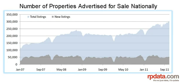
Recent data shows that low construction state’s (Queensland and Western Australia) housing markets are falling, with unsold stock growing and oversupply becoming apparent. If these states with relatively low Rate of Construction are facing oversupply problem, we may expect to be followed by even more oversupplied states like Victoria, South Australia, Tasmania and New South Wales.


References:
- ABS 3101.0 - Australian Demographic Statistics, Jun 2000, June 2010
- ABS 8750.0 Dwelling Unit Commencements, Australia, Preliminary Dec 2010
- United States Census Bureau - Census Data 2000 and 2010
- Federal Reserve Bank of St. Louis – New Private Housing Units Authorized By Building Permit

Tuesday, January 18, 2011

The Housing Bubble Arguments (part 1)

by Raveswei

Introduction

There are many definitions of a housing bubble and they all have in common a rapid price increase of real estate properties not supported by increase of incomes and other economic elements. Two “arguments” are often used in discussions about housing bubble in Australia: “it’s different now” and “it’s different here”. These are not real arguments, but often heard, so we decided to compare Australia with the Australia and Australia now with the Australia during last 15 years.

House Price Supports

First, let’s see if there was any real house price increase since 1995. Chart 1 compares the nominal established median house price indexes for 5 Australian cities with the CPI index and the average total national wage index for all employed persons. Selection of the average total wage index is good because it incorporates labour and work habit changes. This chart does not compare absolute values but only changes over the time. Change of this wage index is very closely related to change of any other wage index (including part time and full time wage indexes) making this chart reliable comparison.

Chart 1 – Australian House Price Indexes vs. CPI and Wages

From the Chart 1 we can see that in just 15 years house prices outperformed CPI by more than twice and wages by almost a twice. In simple terms, this means that somebody with the average wage income only, has to work almost twice as long to buy house now (with no bank involvement) or to produce more than twice as much CPI goods and services to exchange them for the same house.
We also have to consider changes in the employment because the employment may influence house price growth. From the Chart 2, we may see that total employment as a percentage of population increased by less than 10% (from 46% to 50% of total population). Almost all of the increase happened in part time employment alone; full time employment is almost unchanged since 1995. At the same time average household size decreased so the average number of employed persons per households increased by only 2.8%; from 1.3 employed persons per households in 1995 to 1.336 in 2010.

Chart 2 – Australian Employment

It is hard to argue that house price increase can be justified by wage increase, changes in employment or CPI increase alone or combined.
The other argument we often hear is that house price increase is supported by increase of our wealth. There are two major components of the wealth increase that can support house price increase. First one is a wealth created by production of new goods and services (GDP growth) and the second one is wealth that we receive from overseas. It is well known that equity wealth cannot cause its own increase; it takes additional wealth to push equity wealth up. Following chart shows our GDP per capita growth index and house price index all in real terms adjusted for inflation.

Chart 3 Australian House Price Indexes vs. GDP per capita

It is clear that house prices outperformed our GDP per capita by two to three times. This means that each of us needed to increase production of goods and services twice or three times more than what we did in last 15 years so that our newly created wealth may support increased house prices. You may also notice that our real wages were growing faster than real GDP per capita. Real GDP per capita is almost flat since 2006. All our growth is coming from population increase, while our personal wages are going up. This is by itself unsustainable and will have to end sooner or later.

Chart 4 Australian House Price Indexes vs. Net Foreign Liabilities

Other source of the wealth that can support house price growth is wealth received from overseas – in the form of liabilities (mostly debt). On the Chart 4 we compared nominal median house prices for 5 biggest cities and our nominal total net foreign liabilities. Growth of our liabilities almost perfectly matches growth of house prices. Most of this money is used by our banks to support mortgage credit issuance. It is clear from this data that house price increase is not supported by increase in our newly created wealth, but rather by the increase of our debt. Debt driven house prices are one of the best signs of a housing bubble.

Many suggest that people changed spending behaviour by spending more on housing now than 15 years ago. This way it is possible to increase house prices without income or wealth growth. But, this argument cannot be supported by data because our Final Consumption Expenditure grew (170%) since 1995; close to GDP (164%) growth and wages (175%) growth. People did not reduce general spending as a percentage of income. Spending on “Rent and other dwelling services” (does not includes mortgage payments) was growing slightly slower (160%) than the average spending. This means that rental income (for landlords) and imputed renal income (for home owners) was growing slower than the wages. This means that there was no additional income growth from real estate investments to be redistributed to support fast growth of house prices. More about this in a separate analysis; Ref: ABS 5206.0 Australian National Accounts: National Income, Expenditure and Product - Table 8.

Affordability

The other key element that we want to research is the affordability. Many argue that is equally easy (or hard) to buy first house today than what it was in the past. On Chart 5, we compared average FHB mortgage repayment with the average wage over the last 15 years. We calculated index using Mar 1997 quarter as a reference because this was the first period with the Interest Rate equal or close to the average interest rate for the whole periodt. This way we may see how much affordability changed compared to average Interest Rate for this period. Average state wage data is used because no city wage data is available. Rate of change of median and average house prices was very closely correlated. All these data limitations don’t affect our analysis because we calculated changes - indexes, not the absolute numbers. City wages are slightly higher but the change of city and state wages are very closely correlated. It is also important to notice that wage growth was the slowest in the most populous states with the most expensive houses.

Chart 5 Mortgage Repayment/Wage Index

From the Chart 5 we may see that on average repayment increased around 75% more than the average wage since Dec 1996. In some cities (Melbourne) that increase was two and a half times, in some (Sydney) FHB needs to spend 60% more of the wage income on mortgage repayment.

To show relative affordability between cities we calculated absolute values of repayment/double wage.

Chart 6 Mortgage Repayment/Double Wage vs. Employment (x10)

Double wage income is assumed even though there is on average only 1.33 employed people per family and large increase of single parent families in recent years. Although most of the FHB families in reality have double wage income, significant part of that income goes on day-care and similar expenses that skyrocketed in recent time. Any of these assumptions do not affect our comparison, because we assumed the same conditions for all cities.  We also added change of the average number of employed persons per household to the chart to show that employment could not be cause for house price change. Until early 2000s, average double wage FHB family spend between 20 and 30% of their gross wage income on mortgage repayment. Since then it increased by more than two thirds in most of the cities. Sydney is clearly the least affordable city running constantly 10% above other cities. This numbers may not represent actual percentage of an income spend on mortgage repayments but their changes very well represent differences between the cities and changes in the affordability.

Interest Rate

Many argue that falling interest rates are the reason for the house price growth. The following chart shows interest rate and affordability changes.

Chart 7 Mortgage Repayment/wage Index vs. Interest Rate

From the chart you may notice that the affordability is in some way correlated with the interest rate change. We may also see a general trend of rising cost of housing over the interest rate change. In 1995, interest rate of 10.5% drove repayment/double wage to 25% of double wage income, but the interest rate of 9.5% in 2007 increased repayments to more than 40% for the same cities. If interest rate goes up to 10.5%, repayment as a percentage of double wage income will be twice the percentage in 1995. This means that for the same interest rate it is twice as hard to buy house today as 15 years ago. From this point, following the period of extremely low global and local interest rates it is likely that interest rates will go over the levels in 1995-Chart 8.

Chart 8 Standard Variable Interest Rate from Bank

The normal way how interest rates affect house prices is that rising rates force house prices down and falling rates push house prices up. On the Chart 9 we may see that real house prices were increasing while interest rates were rising during the 2002 – 2007 period. After that house prices fallen together with the interest rates (2008-2009), and house prices went up with interest rates since 2009. There was a complete reversal of the relationship. Most of last 15 years house prices were following rates not the other way around that is common and logical. This does not support argument that falling interest rates drew house prices up. It just shows how unusual house price growth was in 2000s.

Chart 9 Real House Price Index vs. Interest Rate

Conclusion

Presented data clearly shows that there was unusual and disproportional increase of house prices relative to any other leading economic indicator. House price increase cannot be justified by wage growth, CPI, interest rate changes, wealth increase, spending habit changes or any other major economic indicator but the debt growth. Using any definition of housing bubble available, it is very likely that Australia is in the middle of the debt driven housing bubble, where house prices increased at least 60% more than any other leading economic indicator. In this paper we do not reject idea that house price growth can be driven by supply and demand changes. We only presented that real economic parameters were not drivers of a huge house price increase since late 90s. Supply/demand arguments will be analysed in the next paper.

References: 
All data provided by ABS and RBA
Chart  1, 2, 3 and 4 - Table1 and Table2
Charts  5 and 9 - Table3
Charts  6, 7 and 8 - Table4


- “Established Median House Price” (Table 2, 3 and 4) and “House Price Index” (Table 2, 3 and 4) columns for period after Mar 2002 is given and calculated based on ABS 6416.0 - House Price Indexes: Eight Capital Cities – data - Median Price of Established House Transfers (grey data in the Table 2 is given); data for a period Dec 1995 – Mar 2002 is calculated using quarterly change data 6416.0 - House Price Indexes: Eight Capital Cities - data; Table: Established House Prices Percentage Change (from previous quarter) and house prices for March 2002.

- “Per week” and “state wage” columns (Table 1, 3 and 4) are given in ABS 6302.0 - Average Weekly Earnings, Australia, Aug 2010 – Table: Earnings; Persons; Total earnings; - seasonally adjusted. Total Earnings for all Employed persons data (Table 3 and 4) is used because it combines changes in the labour – increase of part-time employees as a percentage of total employed persons and change of hours worked per person

- “Repayment/double wage” (Table 4) and “Repayment/wage index” (Table 3) columns are calculated based on standard mortgage loan (90%LVR; 25 years; average Standard Variable Interest Rate from Bank for a given quarter).
“Saving period” (Table 4) and “Saving period index” (Table 3) columns are calculated based on: saving of 20% of total wage, with the interest rate equal to Standard Variable Interest Rate from Bank minus 2.5%