by Raveswei
Introduction
There are many definitions of a housing bubble and they all have in common a rapid price increase of real estate properties not supported by increase of incomes and other economic elements. Two “arguments” are often used in discussions about housing bubble in Australia: “it’s different now” and “it’s different here”. These are not real arguments, but often heard, so we decided to compare Australia with the Australia and Australia now with the Australia during last 15 years.
House Price Supports
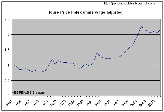
First, let’s see if there was any real house price increase since 1995. Chart 1 compares the nominal established median house price indexes for 5 Australian cities with the CPI index and the average total national wage index for all employed persons. Selection of the average total wage index is good because it incorporates labour and work habit changes. This chart does not compare absolute values but only changes over the time. Change of this wage index is very closely related to change of any other wage index (including part time and full time wage indexes) making this chart reliable comparison.
Chart 1 – Australian House Price Indexes vs. CPI and Wages
From the Chart 1 we can see that in just 15 years house prices outperformed CPI by more than twice and wages by almost a twice. In simple terms, this means that somebody with the average wage income only, has to work almost twice as long to buy house now (with no bank involvement) or to produce more than twice as much CPI goods and services to exchange them for the same house.
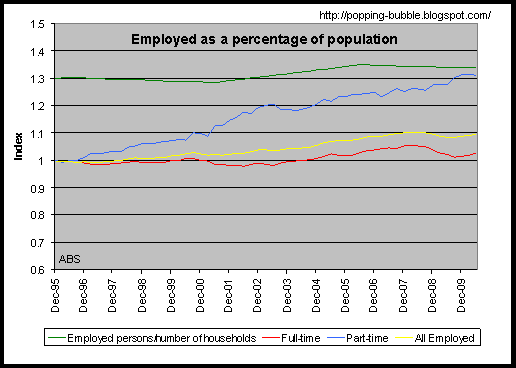
We also have to consider changes in the employment because the employment may influence house price growth. From the Chart 2, we may see that total employment as a percentage of population increased by less than 10% (from 46% to 50% of total population). Almost all of the increase happened in part time employment alone; full time employment is almost unchanged since 1995. At the same time average household size decreased so the average number of employed persons per households increased by only 2.8%; from 1.3 employed persons per households in 1995 to 1.336 in 2010.
Chart 2 – Australian Employment
It is hard to argue that house price increase can be justified by wage increase, changes in employment or CPI increase alone or combined.
The other argument we often hear is that house price increase is supported by increase of our wealth. There are two major components of the wealth increase that can support house price increase. First one is a wealth created by production of new goods and services (GDP growth) and the second one is wealth that we receive from overseas. It is well known that equity wealth cannot cause its own increase; it takes additional wealth to push equity wealth up. Following chart shows our GDP per capita growth index and house price index all in real terms adjusted for inflation.
Chart 3 Australian House Price Indexes vs. GDP per capita
It is clear that house prices outperformed our GDP per capita by two to three times. This means that each of us needed to increase production of goods and services twice or three times more than what we did in last 15 years so that our newly created wealth may support increased house prices. You may also notice that our real wages were growing faster than real GDP per capita. Real GDP per capita is almost flat since 2006. All our growth is coming from population increase, while our personal wages are going up. This is by itself unsustainable and will have to end sooner or later.
Chart 4 Australian House Price Indexes vs. Net Foreign Liabilities
Other source of the wealth that can support house price growth is wealth received from overseas – in the form of liabilities (mostly debt). On the Chart 4 we compared nominal median house prices for 5 biggest cities and our nominal total net foreign liabilities. Growth of our liabilities almost perfectly matches growth of house prices. Most of this money is used by our banks to support mortgage credit issuance. It is clear from this data that house price increase is not supported by increase in our newly created wealth, but rather by the increase of our debt. Debt driven house prices are one of the best signs of a housing bubble.
Many suggest that people changed spending behaviour by spending more on housing now than 15 years ago. This way it is possible to increase house prices without income or wealth growth. But, this argument cannot be supported by data because our Final Consumption Expenditure grew (170%) since 1995; close to GDP (164%) growth and wages (175%) growth. People did not reduce general spending as a percentage of income. Spending on “Rent and other dwelling services” (does not includes mortgage payments) was growing slightly slower (160%) than the average spending. This means that rental income (for landlords) and imputed renal income (for home owners) was growing slower than the wages. This means that there was no additional income growth from real estate investments to be redistributed to support fast growth of house prices. More about this in a separate analysis; Ref: ABS 5206.0 Australian National Accounts: National Income, Expenditure and Product - Table 8.
Affordability
The other key element that we want to research is the affordability. Many argue that is equally easy (or hard) to buy first house today than what it was in the past. On Chart 5, we compared average FHB mortgage repayment with the average wage over the last 15 years. We calculated index using Mar 1997 quarter as a reference because this was the first period with the Interest Rate equal or close to the average interest rate for the whole periodt. This way we may see how much affordability changed compared to average Interest Rate for this period. Average state wage data is used because no city wage data is available. Rate of change of median and average house prices was very closely correlated. All these data limitations don’t affect our analysis because we calculated changes - indexes, not the absolute numbers. City wages are slightly higher but the change of city and state wages are very closely correlated. It is also important to notice that wage growth was the slowest in the most populous states with the most expensive houses.
Chart 5 Mortgage Repayment/Wage Index
From the Chart 5 we may see that on average repayment increased around 75% more than the average wage since Dec 1996. In some cities (Melbourne) that increase was two and a half times, in some (Sydney) FHB needs to spend 60% more of the wage income on mortgage repayment.
To show relative affordability between cities we calculated absolute values of repayment/double wage.
Chart 6 Mortgage Repayment/Double Wage vs. Employment (x10)
Double wage income is assumed even though there is on average only 1.33 employed people per family and large increase of single parent families in recent years. Although most of the FHB families in reality have double wage income, significant part of that income goes on day-care and similar expenses that skyrocketed in recent time. Any of these assumptions do not affect our comparison, because we assumed the same conditions for all cities. We also added change of the average number of employed persons per household to the chart to show that employment could not be cause for house price change. Until early 2000s, average double wage FHB family spend between 20 and 30% of their gross wage income on mortgage repayment. Since then it increased by more than two thirds in most of the cities. Sydney is clearly the least affordable city running constantly 10% above other cities. This numbers may not represent actual percentage of an income spend on mortgage repayments but their changes very well represent differences between the cities and changes in the affordability.
Interest Rate
Many argue that falling interest rates are the reason for the house price growth. The following chart shows interest rate and affordability changes.
Chart 7 Mortgage Repayment/wage Index vs. Interest Rate
From the chart you may notice that the affordability is in some way correlated with the interest rate change. We may also see a general trend of rising cost of housing over the interest rate change. In 1995, interest rate of 10.5% drove repayment/double wage to 25% of double wage income, but the interest rate of 9.5% in 2007 increased repayments to more than 40% for the same cities. If interest rate goes up to 10.5%, repayment as a percentage of double wage income will be twice the percentage in 1995. This means that for the same interest rate it is twice as hard to buy house today as 15 years ago. From this point, following the period of extremely low global and local interest rates it is likely that interest rates will go over the levels in 1995-Chart 8.
Chart 8 Standard Variable Interest Rate from Bank
The normal way how interest rates affect house prices is that rising rates force house prices down and falling rates push house prices up. On the Chart 9 we may see that real house prices were increasing while interest rates were rising during the 2002 – 2007 period. After that house prices fallen together with the interest rates (2008-2009), and house prices went up with interest rates since 2009. There was a complete reversal of the relationship. Most of last 15 years house prices were following rates not the other way around that is common and logical. This does not support argument that falling interest rates drew house prices up. It just shows how unusual house price growth was in 2000s.
Chart 9 Real House Price Index vs. Interest Rate
Conclusion
Presented data clearly shows that there was unusual and disproportional increase of house prices relative to any other leading economic indicator. House price increase cannot be justified by wage growth, CPI, interest rate changes, wealth increase, spending habit changes or any other major economic indicator but the debt growth. Using any definition of housing bubble available, it is very likely that Australia is in the middle of the debt driven housing bubble, where house prices increased at least 60% more than any other leading economic indicator. In this paper we do not reject idea that house price growth can be driven by supply and demand changes. We only presented that real economic parameters were not drivers of a huge house price increase since late 90s. Supply/demand arguments will be analysed in the next paper.
References:
All data provided by ABS and RBA
Chart 1, 2, 3 and 4 - Table1 and Table2
Charts 5 and 9 - Table3
Charts 6, 7 and 8 - Table4
- “Established Median House Price” (Table 2, 3 and 4) and “House Price Index” (Table 2, 3 and 4) columns for period after Mar 2002 is given and calculated based on ABS 6416.0 - House Price Indexes: Eight Capital Cities – data - Median Price of Established House Transfers (grey data in the Table 2 is given); data for a period Dec 1995 – Mar 2002 is calculated using quarterly change data 6416.0 - House Price Indexes: Eight Capital Cities - data; Table: Established House Prices Percentage Change (from previous quarter) and house prices for March 2002.
- “Per week” and “state wage” columns (Table 1, 3 and 4) are given in ABS 6302.0 - Average Weekly Earnings, Australia, Aug 2010 – Table: Earnings; Persons; Total earnings; - seasonally adjusted. Total Earnings for all Employed persons data (Table 3 and 4) is used because it combines changes in the labour – increase of part-time employees as a percentage of total employed persons and change of hours worked per person
- “Repayment/double wage” (Table 4) and “Repayment/wage index” (Table 3) columns are calculated based on standard mortgage loan (90%LVR; 25 years; average Standard Variable Interest Rate from Bank for a given quarter).
“Saving period” (Table 4) and “Saving period index” (Table 3) columns are calculated based on: saving of 20% of total wage, with the interest rate equal to Standard Variable Interest Rate from Bank minus 2.5%