This is my final post on this blog prior to the bubble burst (before this becomes obvious). The Great Australian Housing Bubble is currently going through a bursting stage. Initially all bursts are slow and unnoticeable. Credit squeeze started and with price stagnation and fall it's only to get worse.
My prediction for next few years are:
- average price fall in Australia: 50%-70% from the peak to the bottom (initial fall is going to be slow)
- in some areas (some parts of Sydney, Melbourne, Gold Coast, and some regional areas) prices will fall in excess of 75%
- unemployment will hit 20% (maybe not fake ABS rate)
- all four big banks will be bailed out, some small will be let down
- Australia will record sizable population decline
in meanwhile, enjoy some entertainment on my other blog
https://nobubblehere.wordpress.com/
Monday, April 24, 2017
Monday, January 23, 2017
Measure of Housing Affordability
Median home price is used as a measure of cost of homes by almost everyone trying to quantify housing affordability. Sometimes this price is compared to a median income, sometimes to the past median price or a median price in another country. In all of cases it's the median price that almost always is used and compared. The argument is that median price is a good metric because it makes sure than half of homes are priced less than median. It's clear that median is much better than some other values like mean price but is median as good measure as it appears? Some of the questions that rarely gets asked (and answered) in home affordability studies are: how affordable are non-median homes? How affordable homes are for people who are not median income earners? Is price distribution fixed over time and in various places around the world so it can be used for comparison?
Half of population makes less than median income and half of homes are priced below median but these studies don't show how much below. They don't give clear picture how affordable homes are for people who make 2/3 or half of median income. They don't show how many homes are priced 2/3 or half of median. These studies also don't show what kind of homes are priced at median, 2/3 of median or half of it; are those houses or units, how far from city centers and employment hubs, how large they are (3bdrs or studios, ...). It is somehow assumed that distribution of income roughly follows distribution of house prices making ratio same for all income earners and that income distribution hasn't changed over time making affordability for all income earners changing same as median . It is also assumed that cost of living is proportional to income so that someone making 2/3 of median can use the same percentage of income for mortgage repayments and deposit saving. These studies assume that affordability is equal issue for all income earners and all types of buyers (first buyers, upgraders, downgraders ...). It is also assumed that house price distribution is the same in cities, states and countries across the globe. These studies also ignore the fact that most of people who make above median are middle aged people who already own at least a portion of their home purchased some time ago when prices were different. These people may comprise large part of buyers but income multiple is not relevant as a measure of affordability since large number of these buyers have large equity to start from. All of these assumptions seem to question adequacy of median price in affordability studies.
To try to understand this a bit more, first, we'll take a closer look into house price distribution. Home value data is not so easily available so we'll use freely available sales data for Sydney over the last year to estimate house price distribution. Based on numbers of sales per region (higher turnover in cheaper areas) and number of sales per housing type (more unit sales) we think that actual price distribution is noticeably worse in the sense that lower priced home sales are high disproportionately to their share of total housing. Also median home price is likely to be higher than median sale price due to higher market activity in lower price range. Almost half of all sales in Sydney in past year were unit sales while they represent just over a quarter of housing stock. This makes sale price distribution not perfect representation of actual home price distribution but we have to start somewhere. Real distribution is likely to be much worse in sense that there will be less lower priced homes than the sale statistics shows.
 |
| Figure 1 - Sydney Home Sale Price Distribution 2016 (all homes) |
Figure 1 shows sales price distribution in Sydney. Median sale price for Inner Sydney is over a million ($1.08m) while mean is almost $1.5m. Urban area has median around $855k and mean over $1.15m while Sydney Metro has median of $820k and mean at almost $1.1m. Mean is always significantly higher than median which indicates that distribution is significantly skewed to the right meaning that there are fewer homes much lower than median and more homes priced much over median.
Sydney Inner
There are almost no homes (less than 2%) in Inner Sydney are priced under half of already high median ($550k ), those few are all small units (mostly studios). Less than 10% of all homes are priced under 2/3 of median ($700k) mostly 1 bdr units and studios. There are no houses of any size in Inner Sydney priced under 2/3 of median home price ($700k) and only few under 3/4 of median ($810k). Less than 8% of homes under median ($1060k) are houses. Median house price in Inner Sydney is just under $2m ($1.96m). Median home sale price ($1.06m) can buy an average 3bdr unit in an ordinary suburb or small older 2bdr terrace in some of the least desirable inner suburbs.
Sydney Urban
Situation is only marginally better in Sydney Urban area. Less than 2.5% of all homes is priced under half median ($425k) mostly studios and 1bdr units. There are around only 10% of all homes priced under 2/3 of median ($570k) - mostly 1bdr units. Only 2.5% of all homes are houses priced below 2/3 of median ($570k) - all houses under 2/3 of median are located more than 30km from city centre. Only handful of 'for demolition' houses are priced below half median ($425k). Just over 10% of all homes priced under median ($855k) are houses (mostly in areas 30km from CBD). Median house price in Urban Sydney is $1.25m. Median home price ($855k) can buy 2 bdr unit in suburbs ~ 5km from the city, 3 bdr unit in suburbs ~10km from city or a cheap house in less desirable suburbs more than 30km from the city.
Sydney Metro
In Metro Sydney, including the cheapest outer suburbs (over 50km from CBD), only around 3% of homes is priced under half of median ($410k) and only around 13% of hokes are priced under 2/3 of median ($550k). Affordability improvements only come in size and quality of housing in areas far from the city: compared to Urban and Inner areas where almost no houses were priced under 2/3 of median, large portion of homes between half median and 2/3 of median in outer areas are houses. These houses increase overall distribution of house prices but still manage to make make only 5% of all homes priced under 2/3 of median ($550k) houses - mostly in areas 50km from the city. Despite that, only 20% of homes below median ($820k) are houses. Median house price in all of Sydney is around $1.15m. Median price ($820k) can buy a older 2bdr unit in suburbs ~5km from CBD, new 2bdr or older 3bdr unit in suburbs 10km from CBD, an ordinary house in suburbs 30km from CBD or new house in outer suburbs (over 50km from CBD).
 |
| Figure 2 - Income and Home Sale Price Distribution |
Figure 2 shows home sale price distribution in Sydney and income distribution in Australia. Shape of income distribution in Australia is likely to be a good representation of income distribution in Sydney with the difference that median in Sydney is higher (because of higher wages for average earners). There is also to expect a higher percentage of households well below median because low wage earners are not paid more in Sydney (minimum wage is the same in whole of Australia). Income distribution is also skewed distribution but to a less degree. Sydney median income is estimated to be around $84k gross (this figure includes fictitious income like imputed rent and non-disposable income like superannuation). Simple ratio of median home sale price to median gross income equal to around 10.
The chart shows that the most homes (mode price) are priced close to median (3/4 of median), while most of income earners (mode income) earn between half and 2/3 of the median income. One third (32%) of all households make below 2/3 of median ($56k gross) income. At the same time only around 13% of all homes are priced below 2/3 of median home price (mostly smaller units). Some may argue that very low income earners are not part of housing market so comparison is not valid. Even if we assume that none under half median income would never take part in housing market (this is a poor assumption because many young families fall under this category due to low wages at the start of a career and inability of both partners to work full time while having small children) we there would be 20% of people who make between half and 2/3 of median income competing for only around 13% of all homes in Sydney metropolitan area that are priced below 2/3 of median. There are also large percentage of investors who the most active in this price range pushing prices up and making it even more competitive and harder for young families to buy. It is also important to notice that most of those cheaper homes are not suitable for majority of first home buyers due to small size and poor location. Age group that is likely to buy below median homes (young families under 35) have median income lower than overall median and around 20% lower than 35-55 age group.
Because there are very few homes priced under 2/3 of median that are adequate for young families, large number of these lower paid first home buyers are forced to buy homes that are more expensive than 10 times their income. In many instances this forces young families to pay 15-20 times of their income just to buy a cheapest satisfactory home e.g. 3bdr house or unit still far far from city but with option of tolerable commute time.
As mentioned before, two other points make this situation likely worse: real median home price is higher than median sale home price while real median income is lower than gross median income used in calculations. Also, lower income earners can afford to use much lower percentage of income for a mortgage repayments compared to median earners and don't have much equity to use as deposit. This makes homes prohibitively expensive and totally unaffordable for almost anyone making under 2/3 of median income. To illustrate this consider the case where a young family with two children that makes 2/3 of median gross income ($56k) would after saving 20% of income for almost a decade need over two thirds of their gross income just to repay loan on the cheapest 3bdr home 50km from city (priced $550k) leaving them with less than $400 per week for all other costs.
 |
| Figure 3 Sydney Home Sale Price Distribution 2011 and 2016 |
Figure 3 shown home sales price distribution for Sydney Metro area in 2011 and 2016. Median price increased by over 50% making median homes less affordable. What is more important is that price distribution got more skewed over the same period. To illustrate this we created Figure 4.
 |
| Figure 4. Low priced home distribution Sydney 2011 and 2016 |
In 2011 almost 20% of homes were priced below 2/3 of already much lower median price ($580k). In 2016 percentage of homes under 2/3 of higher median fell to 13% of greatly higher median ($820k). Share of homes priced under one half of median halved from 6% to 3% over the same period. While median price increased 50% in just 5 years, prices of lower priced homes increased much more than prices of median priced homes. The lowest priced homes (priced around $200k in 2011) went up by 75% to $350k in 2016. This shows that affordability for below median earners deteriorated much more than the headline median price to median income figure would suggest. Using simple median price to median income is, in this sense, deceiving because it hides true extent of fall in affordability for large number of below average income earning first home buyers. Situation is much worse and it deteriorated much more than what median multiple numbers would indicate. Home affordability in Sydney situation reached level of crisis where large majority of young people without a home cannot even think of buying a home.
Median multiple (ratio of median income to median home price) is clearly not very good measure of affordability, it's not even good measure to estimate changes in affordability over time but is it good to compare affordability around the world? To check this we'll do house price distribution comparison between some other large world cities. Sales data is freely available for San Francisco, New York and London, but not for other Australian cities. These large and major cities with unaffordable housing are commonly used to compare affordability around the world and to detect housing bubbles.
To make comparison better these cities will also be divided in three areas: Inner, Urban and Metro. In some cases these areas will not directly correspond to Sydney areas but that will be noted. These areas are defined as described in notes 2 to 4.  |
| Table 1 - Population density people per km2 |
Table 1 shows density in different areas of these cities. It's obvious that price comparison is going to be favorable to Sydney and some degree SF because of their much lower density (higher availability of residential land). Inner Sydney area has almost the same density as all of NYC metro area that includes large areas in 14 counties across two states. Next few figures show home sale price distribution in these cities.
 |
| Figure 5 - SF Home Sale Price Distribution 2016
Despite having similar median price ($1.22m) as Inner Sydney it's still possible to find 2bdr condo in some areas of SF for half median ($600k). Two third of median ($800k) can buy a 3bdr condo or a smaller house within city limits. SF metro area has lower median ($810k) and much larger proportion of homes priced much lower than median (21% priced less than 2/3 of median). It's possible to buy a house for half median in some less desirable areas that are just 5-10km from SF and other employment hubs in Silicon Valley. 2/3 of median ($600k) can still buy a large house in a not so bad suburb not very far from employment hubs.
|
 |
Figure 6 - NY Home Sale Price Distribution 2016
Manhattan median price is by far the highest ($1.65m) but despite being so desirable for buyers from around the world, third of all homes are priced below 2/3 of median and quarter below half of median. These below half median homes are mostly small units but it is still not so hard to find 2bd units on Manhattan for half the median ($825k) in many neighborhoods, while 2/3 of median buys even 3bd unit in some not so popular parts of Manhattan. Median price sharply falls by almost 67% to $650k when other boroughs of New York City are included. Despite this dramatic fall in median price almost 13% of homes are still priced under half of median ($325k) and over a quarter is priced under 2/3 of median ($435k). By adding metro areas under around 50km from Manhattan (mostly on New Jersey side) median price drops to $450k with significant portion of homes (mostly houses) priced under 2/3 of the median.
|
 |
Figure 7 - London Home Sale Price Distribution 2016
|
Median sale price in inner London is around £530k with almost 20% priced less than half median and 7.5% under half of median (mostly small units). In Urban area (Grater London) median price is £435k with over 20% of homes under 2/3 of median and over 10% under half of median. London Metro median drops further under £400k with around 20% priced under 2/3 of median and 7% under 1/2 of median.
These least affordable cities in USA and UK do not only have lower median home price to median income ratio than Sydney but also much more favorable home price distribution where much larger percentage of homes is priced below 1/2 and 2/3 of median: Sydney Metro has only 3% under half median while SF Metro has 10%, Sydney Metro has only 13% under 2/3 of median while London Metro has over 21%. Situation is even more extreme for areas closer to city center: Sydney Urban area has only 2.5% under half and 10% under 2/3 while NY Urban area (NYC) despite being much smaller and having lower median has almost 10 times larger proportion of homes (20%) under half and 25% under 2/3 of median.
 |
| Figure 8 - Distribution of under median priced homes in selected cities and areas |
Sydney performs extremely poor in lower priced home affordability in comparison with other expensive cities especially in areas closer to the city center. This means that home affordability for below median income earning first home buyers in Sydney is much much worse than what headline median 'price to median income' suggests. Affordability in Sydney for almost anyone making under median and has no equity or help is literally nonexistent. It would be interesting to see actual statistical distribution of home prices to real income ratio. It wouldn't be very surprising to find out that the ratio is well over 10 making all those mortgages highly risky and sub-prime. Even family with median income buying sub median home (e.g. 3/4 of median) would not be more than few paychecks far from default in case even third of income gets suddenly lost.
This analysis shows that median multiple is very poor tool not only to estimate home affordability (especially for first home buyers) or compare change in affordability over time, but also for comparing housing affordability between various cities around the world. Even more importantly this analysis shows that home affordability is non-existent for all first home buyers who make under median income and many who make even more than median.
- Note 1 - Sydney Subdivisions: Inner Sydney includes suburbs within ten kilometers from CBD including central, eastern, southern and inner western suburbs (post codes 2000-2050 and 2203-2204) and Lower North Shore (post codes 2060-2069, and 2088-2090). Inner Sydney as defined here has area of 190km2 and population of around 690k. Urban Sydney area includes most of Sydney: Inner Sydney, rest of Inner West and North Shore, Western Sydney, Norther Beaches, Northwest areas including Hills District, South Western suburbs, St George and Sutherland Shire. Area of Urban Sydney is around 2800km2 with population of almost 4 million. Metro Sydney area includes Urban Sydney area as well as Outer Western Suburbs, parts of Hawkesbury (areas around Richmond and Windsor) and Macarthur region (areas around Campbelltown) excluding Wollondilly. Area of Metro Sydney is over 4000 km2 and population of 4.5 million. Almost all suburbs in outer Sydney Metro area are more than 50km from CBD with one way commuting times well in excess of one hour.N
- Note 2 - San Francisco subdivisions: Inner SF is defined here as SF city and county proper, Urban SF is defined as area of following counties: San Francisco, urban parts of Alameda, San Mateo, Santa Clara and small urban part of Contra Costa. Metro SF is defined as urban SF area plus city of Vallejo and some parts of Marin County (San Rafael and near surroundings). Metro SF as used here is smaller than comparable Sydney area and much smaller than commonly used San Francisco Bay Area (excludes non-urban parts of Alameda, San Mateo, Santa Clara, most of Solano and Marin counties and excludes Napa and Sonoma counties completely.
- Note 3 - New York subdivisions: Inner NY is defined here as Manhattan, Urban NY area is defined as NY City proper (5 boroughs - Manhattan, Bronx, Queens, Brooklyn, and Staten Island), Metro NY includes Urban area plus Nassau, Westchester, Rockland, Bergen, Hudson, Union, Essex, Passaic, and Middlesex counties in states of NY and NJ. It has to be noted that both Urban and Metro NY areas used here are much more relatively smaller than comparable areas in Sydney. Urban NY city area as defined here (NYC) has density of over 10k per km2 and makes only one third of population of typically used wide NYC metro area. Compared to Urban Sydney with density of 1500 per km2 and 90% of population of total metro area. NY metro area used here (with population of 16 million) is much smaller than commonly used New York–Newark–Bridgeport, NY, NJ, CT, PA area with population of 24 million.
- Note 4 - London subdivisions:: Inner London is defined here as Inner London (as defined by London Government Act 1963) plus City of London. Urban London is defined here as Greater London (density 5.3k per km2) while Metro London is defined as London metropolitan area or sometimes called London commuter belt (including parts of Hertfordshire, Essex, Kent, Surrey, Berkshire and Buckinghamshire Counties) with population of over 14 million and density over 1500 per km2.
Content on this blog is licensed under a CC BY by theaussiebubble.wordpress.com/
Thursday, January 14, 2016
Role of Market Supply During Housing Crash
Many people ask me over and over whether stock on market, unemployment, or vacancy rates need to spike before house prices start falling. That thinking seems to be valid but only if someone assumes that supply side is what drives prices up during boom times. I already covered this issue before but I want to be more clear.
We can look into three indicators to get better understanding of this issue, stock on market (number of homes for sale), rental vacancy rates and number of sales. We'll also look what happened in USA because one of the main arguments for such claims are based on understanding that high foreclosure rate pushed US houses prices down.
Let's have a look in US house prices:
Prices peaked in late 2005, by the end of 2007 were down 20% and by end of 2008 they reached -40%. In some bubbly areas magnitudes were larger (e.g. Phoenix AZ -40% by end of 2007, -75% by the end of 2008) but timing was very similar.
The main question here is: why?
Some people say unemployment rise:
They are wrong. Unemployment was at multi-decade lows at the end of 2007 at what time house prices already lost half of their total losses (20% on average 40% in some cities). Even by the end of 2008 unemployment was still relatively low (under 6%) while by that time house prices fell almost to the bottom.
Some people say subprime mortgage delinquency and foreclosures:

In late 2005 when house prices peaked mortgage delinquency and foreclosures were close to the record lows while By the end of 2007 the spiked to levels not much different to historic lows. By the end of 2008 reached levels 30% over 2002 levels. There is clear correlation between prices and foreclosures but not causation. It seems that foreclosures were behaving similar or slightly lagging in time behind prices. It's unlikely that foreclosures caused house price to fall since they were as often during boom 2002 when prices jumped 10% and 2007 when prices fell by 20%.
Let's see oversupply - new home construction:

Construction was rising and it peaked in late 2005 at the same time as prices peaked. It fell fast afterwards and by end of 2007 was down 60%. Falling construction clearly didn't cause prices to fall during the bust. Maybe construction was so great during boom years with huge unsold inventories that later forced prices down. So, let's see if there was an oversupply of all homes - stock on market:

Number of homes for sale was rising with house prices during bubble period. It peaked in 2006 at the same time house prices peaked but than it fell with house prices. It is hard to argue that falling stock on market was driving price drops. Stock on market was above 'normal' and rising during 2000-2006 period when prices were going up. During house price collapse period 2007-2009 stock on market fell by more than 50% - clearly not driving prices down. If there was a large number of unsold new homes prior to bust they would have appear on market afterwards. The same is case with foreclosures. Despite all of this stock on market was falling with house prices.
Some people say that oversupply went into rental market:

Rental vacancy rate peaked in early 2004 when prices were booming and reached a decade low at the end of 2007 when prices already lost 20%. It's hard to imply that oversupply of homes ended up on rental or that falling rental vacancies pushed prices down.
So if it's not unemployment forcing people to sell, nor foreclosures, nor oversupply (new construction, rising vacancy rates or rising stock on market). It's clearly not increased supply so what is it?
We should look into demand side. House price growth in years prior to 2006 was driven by price speculation, prices were rising because they were rising. Property investors were ready to pay more because they expected further growth and capital gains, occupiers were speculating that prices will be going up so it's better to jump in at any price or miss out forever. Demand was booming and it was supported by easy credit.
Number of new sales:

Number of new home sales peaked in early 2005 before house prices peaked and fell quickly to levels not seen in decades. Demand for new homes collapsed prior do price falls. How about existing homes?

Let see how it all aligns together:

In late 2004 sales peaked while prices and number of homes for sale continued rising. Around 6 months later prices peaked while stock on market continued to rise. Prices started falling at slow rate. In late 2006 stock on market started falling while number of sales continued down - and prices started plummeting despite fall in supply. Falling demand (fall in number of sales) is the only indicator leading house price fall.
12% vacancy rate in USA is not comparable to our vacancy rate because they count all rental homes that are vacant while dodgy sqm only counts those listed on one or two websites for more than 3 weeks continuously. In addition rental market in USA operates differently, largest share of rental homes is owned by businesses which makes normal vacancy rate high - over 7.5% (currently USA is experiencing rental crisis with rents skyrocketing while rental vacancy rate is over 7%) In 2006-2008 period vacancy rate was just slightly over at around 9.5% and it peaked at 11% well after house prices collapsed in 2009.
Stock on market at the peak was significantly lower (0.5% of all homes) compared to current and historical numbers in Australia (~3% of all homes). Many of sellers in Australia are trying to get good price and they will not sell for less at the moment. But when demand collapses there is always enough supply (people who need or want to sell regardless of market conditions) to drive prices down on low volumes (US home prices collapsed in 2006-2009 period on record low volumes not seen since WWII). It only takes a few sellers willing or forced to accept anything to push prices into the ground.
Sydney sale volumes peaked (current cycle) in mid 20014, Melbourne in mid 2015, nationally it is probably peaking around this time, ...
We can look into three indicators to get better understanding of this issue, stock on market (number of homes for sale), rental vacancy rates and number of sales. We'll also look what happened in USA because one of the main arguments for such claims are based on understanding that high foreclosure rate pushed US houses prices down.
Let's have a look in US house prices:
 |
| US house price index |
The main question here is: why?
Some people say unemployment rise:
 |
| US unemployment |
They are wrong. Unemployment was at multi-decade lows at the end of 2007 at what time house prices already lost half of their total losses (20% on average 40% in some cities). Even by the end of 2008 unemployment was still relatively low (under 6%) while by that time house prices fell almost to the bottom.
Some people say subprime mortgage delinquency and foreclosures:

In late 2005 when house prices peaked mortgage delinquency and foreclosures were close to the record lows while By the end of 2007 the spiked to levels not much different to historic lows. By the end of 2008 reached levels 30% over 2002 levels. There is clear correlation between prices and foreclosures but not causation. It seems that foreclosures were behaving similar or slightly lagging in time behind prices. It's unlikely that foreclosures caused house price to fall since they were as often during boom 2002 when prices jumped 10% and 2007 when prices fell by 20%.
Let's see oversupply - new home construction:

Construction was rising and it peaked in late 2005 at the same time as prices peaked. It fell fast afterwards and by end of 2007 was down 60%. Falling construction clearly didn't cause prices to fall during the bust. Maybe construction was so great during boom years with huge unsold inventories that later forced prices down. So, let's see if there was an oversupply of all homes - stock on market:

Number of homes for sale was rising with house prices during bubble period. It peaked in 2006 at the same time house prices peaked but than it fell with house prices. It is hard to argue that falling stock on market was driving price drops. Stock on market was above 'normal' and rising during 2000-2006 period when prices were going up. During house price collapse period 2007-2009 stock on market fell by more than 50% - clearly not driving prices down. If there was a large number of unsold new homes prior to bust they would have appear on market afterwards. The same is case with foreclosures. Despite all of this stock on market was falling with house prices.
Some people say that oversupply went into rental market:

Rental vacancy rate peaked in early 2004 when prices were booming and reached a decade low at the end of 2007 when prices already lost 20%. It's hard to imply that oversupply of homes ended up on rental or that falling rental vacancies pushed prices down.
So if it's not unemployment forcing people to sell, nor foreclosures, nor oversupply (new construction, rising vacancy rates or rising stock on market). It's clearly not increased supply so what is it?
We should look into demand side. House price growth in years prior to 2006 was driven by price speculation, prices were rising because they were rising. Property investors were ready to pay more because they expected further growth and capital gains, occupiers were speculating that prices will be going up so it's better to jump in at any price or miss out forever. Demand was booming and it was supported by easy credit.
Number of new sales:

Number of new home sales peaked in early 2005 before house prices peaked and fell quickly to levels not seen in decades. Demand for new homes collapsed prior do price falls. How about existing homes?

Let see how it all aligns together:

In late 2004 sales peaked while prices and number of homes for sale continued rising. Around 6 months later prices peaked while stock on market continued to rise. Prices started falling at slow rate. In late 2006 stock on market started falling while number of sales continued down - and prices started plummeting despite fall in supply. Falling demand (fall in number of sales) is the only indicator leading house price fall.
12% vacancy rate in USA is not comparable to our vacancy rate because they count all rental homes that are vacant while dodgy sqm only counts those listed on one or two websites for more than 3 weeks continuously. In addition rental market in USA operates differently, largest share of rental homes is owned by businesses which makes normal vacancy rate high - over 7.5% (currently USA is experiencing rental crisis with rents skyrocketing while rental vacancy rate is over 7%) In 2006-2008 period vacancy rate was just slightly over at around 9.5% and it peaked at 11% well after house prices collapsed in 2009.
Stock on market at the peak was significantly lower (0.5% of all homes) compared to current and historical numbers in Australia (~3% of all homes). Many of sellers in Australia are trying to get good price and they will not sell for less at the moment. But when demand collapses there is always enough supply (people who need or want to sell regardless of market conditions) to drive prices down on low volumes (US home prices collapsed in 2006-2009 period on record low volumes not seen since WWII). It only takes a few sellers willing or forced to accept anything to push prices into the ground.
Sydney sale volumes peaked (current cycle) in mid 20014, Melbourne in mid 2015, nationally it is probably peaking around this time, ...
Saturday, May 23, 2015
Australian Housing time has come ...
Based on debt levels, economic conditions, mining bust and finally google trends data (see my previous post) I predict that peak price will be reached within 6 months. It will be followed by, at the beginning, slow decline over 6-12 months and than accelerated collapse.
 |
| Google Trends - "housing bubble" in Australia |
Saturday, November 2, 2013
"Bubble Truths" and "anxiety about overpriced housing is overblown"
An article from the mainstream media brought interesting insight into a "bubble mind". In an interview, one of the famous Australian economists Stephen Koukoulas (with over more than 25 years of professional experience as an economist in government, as Global Head of economic and market research, a Chief Economist for two major banks and as economic advisor to the Prime Minister) asked simple question:
''What would you prefer? House prices three times' average incomes with 13 per cent interest rates or house prices four or five times' average incomes with interest rates under 7 per cent?Economics used to be a science, not opinion field, so lets see how good scientist one of the Australian most famous economists really is.
''The bottom line is the repayments are roughly the same.''
According to RBA 1982 was the last year when Standard Variable interest rate was 13% and ratio between an average house price and average income was 3. An average repayment after purchase was 33% of the income (25 year loan, 80% LVR, deposit equal to 60% of annual income).
Today, ratio between an average house price and average income is around 7 (according to RBA). Standard variable interest rate is 5.95%, repayment 45% of income (30 years loan, 90% LVR, deposit 70% of annual income).
First year repayment today is 36% higher than what it was when home prices were 3 times income and IR 13%.
But that is not the end of the story. Houses take decades to repay, so let see how repayments change over time.
In year 2, repayment was equal to 29% for 1982 buyer (IR dropped to 12.5%, income grew by 9%), and 43.5% for today's buyer (assuming IR and income growth stay the same).
In year 3, repayment dropped to 25% of income for 1982 buyer (IR dropped to 12%, income grew by 11%) and 41.5% of income for today's buyer (assuming IR and income growth stay the same).
In year 4, repayment dropped to 23% of income for 1982 buyer (IR dropped to 11.5%, income grew by 5%) and 40% of income for today's buyer (assuming IR and income growth stay the same).
In year 5, repayment dropped to 21% of income for 1982 buyer (IR increased to 12%, income grew by 7%) and 38.5% of income for today's buyer (assuming IR and income growth stay the same).
Total cost of house ownership (including deposit) in first 5 years was 190% of income for 1982 buyer and 280% for today's buyer. Despite significantly lower rates, higher LVR and longer loan term, houses today are 47% more expensive in first 5 years than they were in 1982.
Over the life time of a mortgage (25 vs 30 years), today's potential buyer (with assumption that rates stay low) would pay more than twice in income terms for an average house than buyer from 1982.
Economist Stephen Koukoulas says the anxiety about overpriced housing is overblown because the burden of today's big home loans has been completely offset by the saving from low interest rates.
Completely offset?
Don't worry and buy because "anxiety about overpriced housing is overblown"?!
Monday, February 18, 2013
What caused Housing Bubbles in UK
UK has recorder one of the most volatile house prices in the West since WWII. Many economists use UK as a prime example how "land restrictions cause housing bubbles". But you they failed to provide evidence that UK home price volatility is caused by land restrictions and not something else.
They overlooked the fact that beside tough land restrictions UK has the least stable and the most speculative banking system in the West. Maybe that has something to do with price volatility. Lets explore:
If we look into history of UK banking you will find very interesting correlation between banking regulation changes and housing bubbles.

Home prices in UK were relatively stable during 50s and 60s. Prices were slowly going up while government was slowly introducing "land development restrictions" in 1960s. This price growth could be attributed to land restriction regulation in addition to other causes (real income growth, etc.).
Suddenly, after decades of stability, house prices spiked in early 70s. Interestingly, that happened immediately after significant bank deregulation process: Competition and Credit Control in 1971 and big bank mergers in late 60s (during just two years in 1968, five big bank mergers occurred) . Competition and Credit Control relaxed bank reserve requirements, allowed deposit banks to participate on the market, removed interest rate collusion ... More interestingly, in 1970 (just before the bubble) new conservative government started relaxing many of the land development restrictions introduced by labour in decade before. Bubble burst and prices drop by 30% by mid late 70s. During this period of falling prices new labour government introduced new and tougher land restrictions but that didn't prevent house prices from falling.
Than, in late 70s, foreign exchange controls were lifted and 1979 Banking Act was passed. That coincided with the housing bubble that peaked in early 80s. This bubble was much smaller but real prices fell almost 20% after the burst.
New conservative government started reforms that included removal of some land restrictions laws and big banking reform. In mid 80s ‘Big Bang’ reforms were passed (1986). These reforms caused expansion of building societies and relaxation of lending standards. Deregulation turned building societies into real banks and enabled them to lend money freely. This was followed by big housing bubble of late 80s.
Finally, world wide deregulation and globalisation of late 90s happened just before great housing bubble of 2000s. Lending standards were dropped, bank funding became obscure and credit issue relaxed. UK banking sector tripled in less than a decade. Speculations became global, included insurances, big funds ...
This clearly shows that every UK housing bubbles since WWII occurred after a new bank regulation rules were passed (almost identical causation can be showed for USA, Australia ...). In some instances lend restrictions rules had been lifted before bubbles started inflation. These relaxations of land restrictions failed to prevent bubbles from happening.
In addition, the theory that land supply restrictions cause house price volatility is very hard to apply on UK cities where population significantly declined over the last 40 or 50 years (Manchester, Liverpool, Sheffield ...). These cities did not require much of a new land to meet new demand, still prices were more volatile there than in cities with fast growing population and end even more land restrictions like London.
- Richard Davies, Peter Richardson, Vaiva Katinaite and Mark Manning of the Bank of England - Evolution of the UK banking system - 2010
- Peter Scott - The Property Masters - Taylor & Francis - 2013
Monday, November 19, 2012
Post-construction boom plan?
There is a lot of talk recently about RBA's new great idea of replacing the mining boom with a construction boom. It is quite possible that could work, and we continue growth by shifting ex-mining investments into housing construction. This is not new idea. It was very "successfully" implemented in quite a few places around the world recently. Irish and US governments successfully replaced IT boom of late 90s with period of steady growth driven by construction boom. Chinese government partially did the same thing after their export boom ended. Historically, it seems it's quite easy to succeed with this plan.
BUT, there is one much more important question that nobody seems to be asking in Australia: even if the great idea of construction boom replacing mining succeeds, what will replace construction boom at its end in three or five years?

If everything goes as planed, in just 5 years we will have million more homes - half of them empty (around half a million more new homes than new households), we will have around half a trillion more debt (half a trillion less invested in productive business and infrastructure) Maybe we can continue doing the same for 5 more years after. By than we should have million more empty homes and trillion more in debt.
BUT, what will happen after we take more debt and misallocate it into more empty houses? What is the great idea promises us after?
I'm scare even to think about this.
I hope our government's great ideas fails quickly. I hope for that not because I think we will be fine if it fails (we will not), but because I'm sure in 5 years we will be much better than if they succeed. For majority of Australians (especially our kids) going into few years long recession in 2013 is much better option than going into decade long deep depression in 2018.
I hope, we learned something from other's mistakes.
Thursday, June 21, 2012
Census and Australian housing shortage/oversupply
Preliminary Census data is published a few days ago - census link, and as I expected it just confirmed some of my projections.
- Total population increased to 21.5m, while total number of dwelling increased to 9.1m.
- Population growth over the last 5 years was lower than projected (around 300k less – 60k less per year)
- Household size remained stable at 2.6
- 65+ is the fastest growing population group
- Median household income was $64k
Housing data is also interesting.
Ownership rate decreased from 68.1% to 67%. Outright ownership decreased from 34% to 32.1%. Percentage of mortgage owners and renters who spend more than 30% of income on housing increased as well. Income increased only 20% while house prices increased 33.3%, and median mortgage repayment 38% over the previous 5 years. Although income and repayment census data is not very reliable, this suggests that housing became less affordable.
Percentage of unoccupied dwellings increased from 10.4% to 10.7%. Total number of households increased by 616k; number of private dwellings increased by 720k. More than 100k dwellings that were built since 2006 are not occupied. One new dwelling was built for every 2.3 new residents while average household size stayed 2.6.
All this suggests that there is no housing shortage in Australia. In fact, it suggests that oversupply of homes increased in 5 years. The oversupply increase since 2006 seems to be higher than what I predicted here. The likely reasons for this are wrong population growth estimates and my methodology that tends to underestimate oversupply. This means that current oversupply most likely exceeded one million homes.
Oversupply of homes is significantly up, price to income ratio is up, demography is getting worse, … It seems that there is nothing about real demand and supply that can drive house prices up (or support current prices). It is all down to speculative demand and credit availability.
Friday, April 13, 2012
Why we are so different - according to RBA
RBA head of financial stability, Luci Ellis, delivered few days ago a speech at Financial Markets Conference in Atlanta. Ms Ellis “explained” why the US housing market bubbled and then busted, and why the Australian housing market will not burst. She made several arguments why we are different. All of them wrong. I will concentrate here on two points:
The first is that housing supply is quite elastic here, at least in enough parts of the country to matter. The housing boom was a construction boom as well as a price boom. As a result, by 2006 there was already a substantial overhang of excess supply (Graph 1). The inherent stock-flow interaction in the housing market means that construction booms sow the seeds of their own destruction. Prices can undershoot formerly sustainable levels.US construction in 2000s was (in nominal terms) lower than in 1970s and 1980s. In relative terms (relative to population or total existing housing stock) construction rate at the peak in mid 2000s was by far lower than in all previous decades.

This is what she calls US “construction boom”. During the same period we were building at the rate of almost 2%.
More interestingly, in states where developments were restricted construction “boom” was lower while bubble was bigger. Supply side restrictions just amplify house price growth but don’t stop prices from falling. Places with the most supply restrictions (Las Vegas, California …) recorded largest house price drops although none of supply restrictions was lifted in meanwhile. Places with no restrictions like Texas or Georgia recorded no price growth.
This links to the third factor, which is that a range of tax and legal differences, as well as industry convention, created a system that discouraged amortisation. Interest-only loans, explicitly negative amortisation loans and cash-out refinancing, all meant that loan-to-valuation ratios that were high at origination, stayed high well into the life of the loan. American households are less likely to pay their mortgages down ahead of schedule than Australians (Graph 2). Trade-up buyers seem to have high loan-to-valuation ratios in the United States; that doesn't appear to be true in Australia. The result of all this is that the US housing stock is far more leveraged than that in Australia, even during the boom period (Graph 3).
While it's true that Australia does not provide tax benefits for PPOR mortgages it provides significant benefits for property investments. Americans have interest in not paying mortgages ahead of schedule, while Australians don’t. Even with this “advantage” Australians managed to increase LVR during housing boom while Americans decreased it. Australians were adding more debt and much faster (relative to home prices) than they are able to repay ahead of schedule. So, we are paying mortgage faster but or those mortgages grew so quickly that debt is skyrocketing.
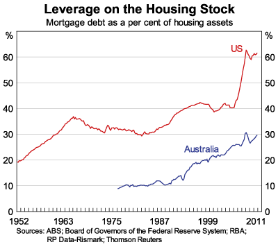
Australia has higher percentage of interest only loans which shows that less people in Australia are interested in owning house – these people only think about price speculation. Since boom started we increased out leverage by almost 50% while Americans decreased their leverage during boom years (by almost 10%). After house price fell US leverage jumped up to level almost 50% higher than pre-boom levels. When our bubble bursts leverage will jump to levels at least 150% higher than pre-boom period (probably 200% or even more). It’s already 50% up.
RBA is already left with very little credibility and this is just one more step toward losing all of it.
Wednesday, February 8, 2012
Market Inventory vs Bubble Burst
There is strong belief among Australians that housing market will not crash because majority people will not be willing or forced to sell for reduced price. Although it is true that majority of people will not sell at low price, there is misconception how many forced or willing sellers is necessary to crash the market.
Let's see behaviour of market stock in Australia over the past 5 years or so:
From the chart, we can see that number of homes for sale doubled since first housing troubles started in 2008. Stock slightly decreased during short boom in late 2009 - early 2010 but increased 50% since then. Similar data comes from SQM - Chart 2
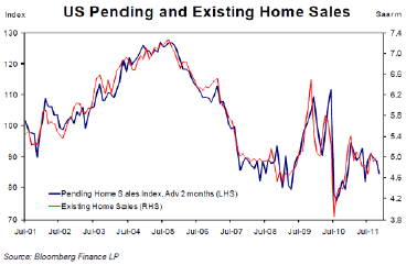
From observation of a recent events in USA, I noticed that significant rise in inventories is not needed for price to crash. If we take a look at US existing house inventories (Chart 3) we can clearly see that inventories didn't increased more than inventories in Australia.
From the chart we can see that home inventories in USA at the peak were lower than current inventory in Australia. At the peak inventories were only about 4% of total housing stock, while that percentage already passes 4.5% in Australia. It is hard to say that 4% of the total stock is extreme number that caused 33% price crash in USA. We should also notice that stock on the market fell in late 2008 early 2009 when house prices dropped the most. This means there is something else that significantly affects house prices.
Lets take a look at sales:
It is clear that drop in sales, significantly affected housing market in USA. Lack of buyers seems to have much larger effect on price than rise in inventories. It is expected there will always be significant number of people forced or willing (for any reason) to sell, but it's hard to expect significant number of buyers (especially if credit freezes and/or unemployment hits).
Let's see whether this holds in Australia
It is clear that house price fall in 2008/2009 was caused by significant fall in sales. House prices recovered driven by new buyers although stock on market remained elevated compared to pre 2007 levels.
It looks like inventory levels at the moment are more than enough to enable market crash, it's up to buyers to set market direction. Recent drop in sales (since 2010) is larger than drop recorded in USA during the first two years of price contraction. If soon buyers do not return to the market in large numbers, we may expect price fall to accelerate. There is no need for mass panic sale for prices to fall significantly.
Let's see behaviour of market stock in Australia over the past 5 years or so:
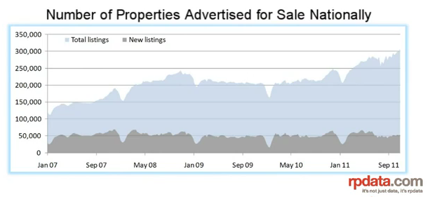 |
| Chart1 Stock on the market RPdata |
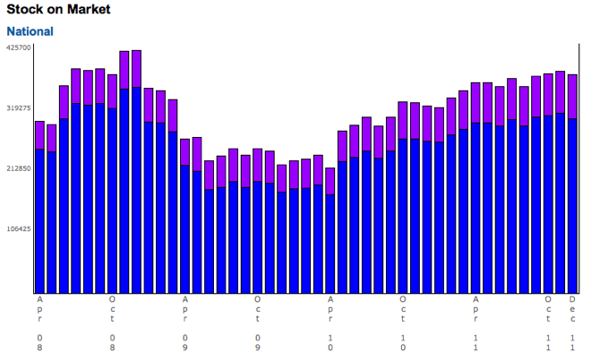 |
| Chart2 - Stock on the market SQM |
 |
| Char3 - US existing home inventory |
From the chart we can see that home inventories in USA at the peak were lower than current inventory in Australia. At the peak inventories were only about 4% of total housing stock, while that percentage already passes 4.5% in Australia. It is hard to say that 4% of the total stock is extreme number that caused 33% price crash in USA. We should also notice that stock on the market fell in late 2008 early 2009 when house prices dropped the most. This means there is something else that significantly affects house prices.
Lets take a look at sales:
 |
| Chart4 - US home sales |
Let's see whether this holds in Australia
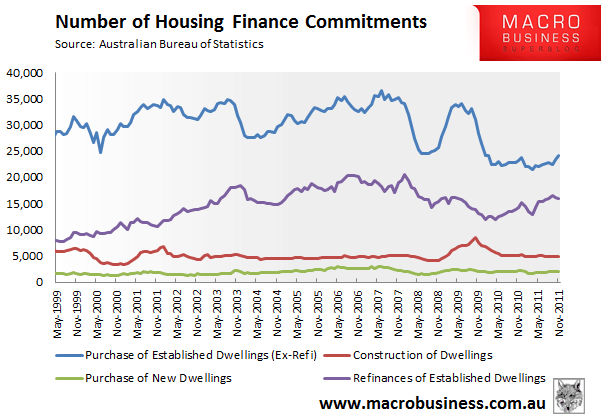 |
| Chart 5 - Australia home sales |
It looks like inventory levels at the moment are more than enough to enable market crash, it's up to buyers to set market direction. Recent drop in sales (since 2010) is larger than drop recorded in USA during the first two years of price contraction. If soon buyers do not return to the market in large numbers, we may expect price fall to accelerate. There is no need for mass panic sale for prices to fall significantly.
Subscribe to:
Posts (Atom)